-
Shop
- Adidas
- Advanced Technologies
- AI Skills Mastery 2026 Collection
- Apple Accessories
- Armani
- Best-Sellers
- Calvin Klein
- Car Accessories
- Clothing
- Dating & Social Skills
- Digital Resources
- Beauty
- Budgeting & Saving
- Car Buying & Ownership
- Cozy Feast Collection
- Emotional Intelligence
- Entrepreneurship & Business Growth
- Financial Education
- Financial Independence
- Financial Mindset & Psychology
- Goal Setting
- Hobbies
- Leadership
- Mindfulness
- Motivation
- Parenting & Child Development
- Personal Style & Fashion
- Pet Lifestyle & Wellness
- Positive Thinking
- Self Confidence
- Sleep Improvement
- Stress Management & Relaxation
- Travel Planning
- Yoga & Fitness
- Yoga & Mind-Body Practices
- Education & Learning
- Family & Parenting
- Fashion
- Accessories
- Alexander McQueen
- Bags
- Bags & Wallets
- Balenciaga
- Belts
- Blazers
- Blouses & Shirts
- Bottega Veneta
- Brunello Cucinelli
- Burberry
- Chanel
- Chloé
- Dior
- Dolce & Gabbana
- Dresses
- Etro
- Fendi
- Gucci
- Hats & Hair Accessories
- Hoodies & Sweatshirts
- Jacquemus
- Jewelry
- Jil Sander
- Jimmy Choo
- Kiton
- Luggage
- Luggage Bags
- Miu Miu
- Off-White
- Prada
- Rick Owens
- Saint Laurent
- Scarves
- Shoes
- Socks & Tights
- Sunglasses
- Sweaters & Cardigans
- The Row
- Tom Ford
- Tops & Shirts
- Valentino
- Valentino Garavani
- Versace
- Vivienne Westwood
- Watches
- Fashion Accessories
- Gadgets
- Guess
- Health & Beauty
- Health & Wellness
- Home & Garden
- Home Supplies
- Kids & Babies
- Kitchen Best-Sellers
- Luxury Brands Collection
- Nike
- Online Business for Beginners
- Patio, Lawn & Garden
- Personal Growth
- Pet Care
- Pet Supplies
- Pets
- Smart Home Living Guides
- Sport & Outdoors
- Super Deals
- TikTok Growth & Monetization Mastery
- Travel
- Wealth
- Wealth Building
- Popular
- Best deals
Color-Coordinated Wardrobe: Personal Palette & Easy Outfits
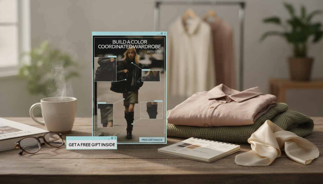
Build a Color-Coordinated Wardrobe with Ease: Personal Palette, Outfit Matching, and Smart Styling
A color-coordinated wardrobe reduces decision fatigue, makes outfits look intentional, and helps every piece earn its place. The goal isn’t to limit style—it’s to choose a personal palette that flatters, mixes effortlessly, and supports real-life outfits for work, weekends, and events.
What a Color-Coordinated Wardrobe Actually Means
A cohesive wardrobe isn’t about wearing the same outfit on repeat. It’s about building repeatable color combinations so getting dressed feels automatic. When your closet “speaks the same language,” fewer items can create more outfits.
- A cohesive wardrobe is built on repeatable color combinations, not identical outfits.
- Most outfits work best when built from neutrals plus one or two accent colors (and an optional print).
- Coordination is about harmony—undertone, contrast, and saturation—rather than strict “matching.”
- A strong palette makes mix-and-match easier, so your wardrobe works harder with less.
If you’ve ever owned great pieces that felt impossible to style together, odds are the colors weren’t harmonized (or the contrast level was fighting itself). Fix the palette, and the outfits follow.
Find Your Personal Palette: Undertone, Value, and Contrast
Start by choosing colors that cooperate with your natural coloring and your preferred vibe. Color theory tools can help you visualize combinations (see Adobe Color), but your best guide is how shades behave next to your face and in daylight.
Undertone
Undertone is the quiet “temperature” underneath color: warm, cool, or neutral. Try a quick jewelry test (gold vs. silver), compare crisp white versus cream near your face, and drape fabrics to see what makes your skin look clearer and more even.
Value (light to dark) and contrast
Value is how light or deep a color is. Contrast is the distance between your lightest and darkest pieces. Low-contrast outfits feel soft and modern; high-contrast outfits look sharp and graphic. Choose a default contrast that feels natural, then use accessories or outerwear to dial it up or down.
Saturation (muted to bright)
Muted palettes blend easily and feel relaxed. Brighter palettes create high-impact outfits with fewer pieces—great if you want your wardrobe to feel energizing without adding more items.
| Palette Element | How Many | Examples (swap to suit undertone) |
|---|---|---|
| Core neutrals | 2–3 | Navy, charcoal, soft white / camel, warm brown, cream |
| Supporting neutrals | 1–2 | Taupe, olive-gray / stone, chocolate |
| Accent colors | 2–4 | Teal, burgundy, blush / rust, forest green, mustard |
| Metal/finish | 1 | Silver / gold / mixed metal |
| Print family | 1–2 | Stripes, small checks, florals in your palette |
For deeper color terminology and standardized references, browse Pantone, and for a friendly refresher on fundamentals, Color Matters is a solid starting point.
Choose a Base: The “Anchor Neutral” That Does the Heavy Lifting
Your anchor neutral is the color you use most often for bottoms, shoes, and outerwear—so outfits assemble quickly. Common anchors include navy, black, charcoal, chocolate, and camel. The “best” one is the one you’ll actually wear three days a week.
- Pick one anchor neutral you can commit to (and that matches your lifestyle).
- Build tops, outerwear, and shoes around the anchor so you aren’t guessing at pairings.
- Add a second neutral for depth (navy + cream; charcoal + soft white; camel + olive).
- Keep denim within the same temperature and depth—very light wash and deep indigo can clash if everything else is muted.
A reliable layer in your neutrals makes the whole closet feel more “done.” If you want a structured option that pulls casual pieces together, consider the Elegant Autumn Short Blazer for Women as an outfit-finisher that works with both denim and trousers.
Smart Outfit Matching Rules (That Don’t Feel Rigid)
Color coordination doesn’t require strict rules—just a few repeatable defaults. When something looks “off,” it’s usually one small variable, not the whole outfit.
- Try the 60–30–10 idea: 60% neutral, 30% secondary, 10% accent.
- Repeat a color twice for cohesion (top + accessory, shoe + bag, print + lipstick).
- Pair one statement piece with basics (bright top + neutral pants; bold skirt + simple knit).
- If an outfit feels wrong, adjust one variable: swap shoes, change the outer layer, or add a bridging accessory (belt, scarf, bag).
A classic belt is an underrated “bridge” because it visually connects your top and bottom while reinforcing your metal tone. The Men’s Genuine Leather Belt with Solid Brass Buckle can anchor outfits built around warm neutrals (camel, chocolate, cream) and adds polish to denim without looking fussy.
Build a Mini Capsule Using Your Palette (Fast Start Method)
If you want a guided system that turns palette ideas into outfit formulas and shopping checklists, Build a Color Coordinated Wardrobe with Ease (eBook guide) is an easy reference to keep on your phone while you plan outfits, pack, or shop.
Shop and Edit Without Breaking the Palette
A Practical Guide for Building Your Palette and Outfits
FAQ
How many colors should be in a personal wardrobe palette?
Start with 2–3 core neutrals and 2–4 accent colors. Prints can count as part of the palette when they repeat your neutrals and accents, and you can expand slowly once your base mixes well.
What if a favorite color doesn’t flatter the complexion?
Wear it away from your face (pants, skirts, bags, or shoes), or tweak the shade to better suit your undertone (cooler/warmer), value (lighter/darker), or saturation (muted/brighter). You can also balance it with a flattering neutral near your face.
How can outfits look coordinated without being “matchy”?
Repeat a tone once or twice (like shoes plus a bag), mix textures instead of duplicating exact shades, and keep to one statement piece at a time. A consistent metal tone and a reliable anchor neutral help outfits feel unified without looking overly matched.
Recommended for you


Infrared Sauna for One Person: Compact Home Recovery
Jun 19, 2026








Leave a comment